Recipe
Makes cooking easier
Overview
Recipe is a website that makes it easy for cooks of all skill levels to find and follow recipes. When you look up a recipe online, you’re often bombarded with a variety of results from different authors, each with its own variations. Recipe solves this problem by bringing all of these recipes together in one place. This makes it easy to find the perfect recipe for your needs, no matter what your skill level or dietary restrictions
Roles
User Research, Wireframing, Lo-fi Prototyping, Hi-fi Prototyping, Product Design
Timeline
2 Weeks
Group Members
Solo project
The Problem
Finding recipes online can be challenging. There are many different variations of dishes, all rated very highly, and it can be difficult to know which one to pick. Additionally, cookbooks can be expensive, and many websites have too much fluff or ads making it not trustworthy to some users.
The Solution
Create a website to easily filter recipes, give ideas, and find which one to follow all in one place. Reduce the friction from picking the right recipe among all variations.
Design Process
User Research
Initially, I started off by going through user interviews asking them questions about finding recipes online, their process in choosing which one to follow, and if they look up new recipes to try or reuse the same ones they have in the past. Above are photos of questions I asked and why I asked them, as well as key take aways from them.
Quotes from interviews:
“I don’t want to read this whole backstory of the dish and why the author likes it I just want the ingredients, step-by-step procedure, and possibly a video showing me because sometimes reading what to do can be confusing.”
“I don’t know whose recipe is good and whose isn’t, I just go with the top one I find on Google”
“When I don’t know the name of a dish I try to ask someone & describe it to them but most of the time I'm out of luck”
“Most of the time I don’t even know what I want to make, which is the hardest part of cooking”
“It’s sometimes hard to trust a website because they are riddled with ads and when I click on something it takes me to a new website entirely”
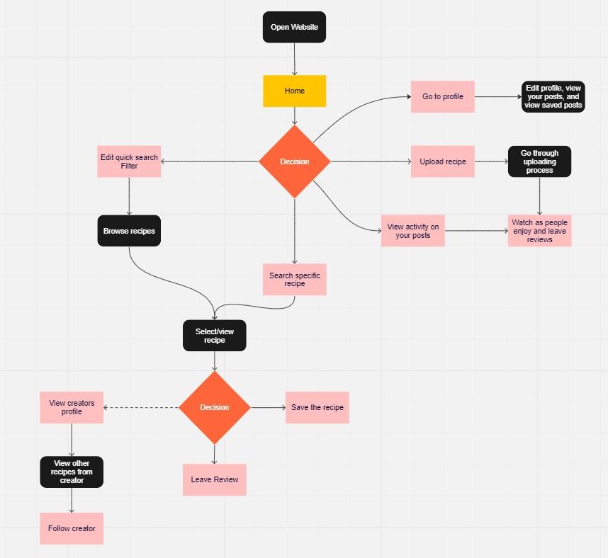
I created a site map and user flow diagram after conducting user research to understand what users might want from this website. Based on this research, I made the general flow of how the website will work. I wanted to create a simplistic, easy-to-use flow, so I focused on identifying the key screens and how they would interact. This process helped me to create a user-friendly website that is easy for users to find what they are looking for and complete their tasks.
Sketches
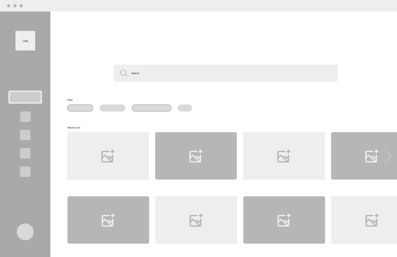
Before creating a digital prototype I drew wireframes for each key screen. These wireframes were the outline for creating the low-fi prototype. I used information from my previous round of research on what users would want to see on the website.
Version 1
Traditional style with other websites
Easy to understand and navigate
Hierarchy is all over the place
Version 2
Easy to change or alter tabs
Simpler design
Will result in less blank space across tabs
There are two possible layouts for the website, each with its own advantages and disadvantages.
Version 1 has a traditional design that is similar to other websites. This makes it easy for users to find their way around, but it can be difficult to fit all of the information on the page without making it cluttered.
Version 2 has a more modern design with tabs in the sidebar. This allows for more flexibility in terms of how the information is displayed, but it can be more difficult for users to find what they are looking for if they are not familiar with the layout.
After some user research, it was deduced users would prefer to go with version 1.
Improvements
Create a new filter layout on the home page
Create a simplistic user experience with modern designs
Properly space out the layout of each screen
Create views for each interaction
Hi-Fi Prototype
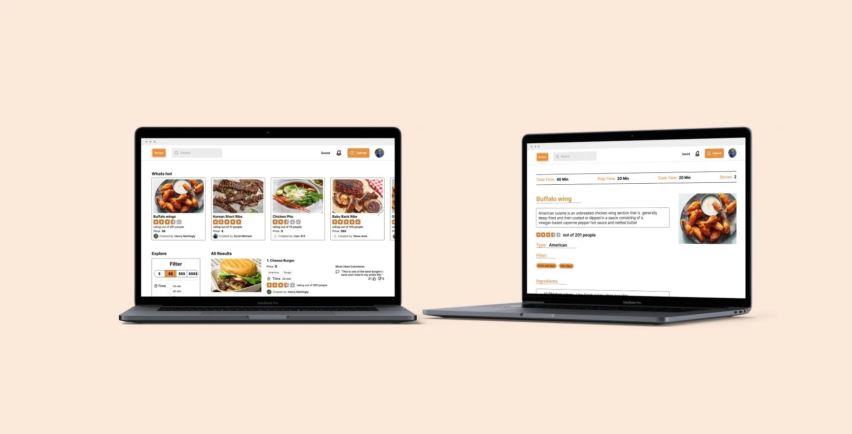
The designs for each of the key screens on the website were created with the intention of providing the desired information to the users with as few screens as possible in a way that is easy to understand. The key screens on the website are the ones that users are most likely to visit.
Validation Test
Once the Hi-Fi prototype was complete I went through a round of product testing and User Research. Users appreciated how simple the layout was and the versatility of the filter system being able to search through ingredients, type of food, type of meal, etc. Users also liked how you are able to save and group recipes. Each screen flows into the other providing a seamless experience. A quote from a user I interviewed “This feels like Yelp but for recipes instead of restaurants”. Overall the validation test was a success.
Whats next?
Update creating a post - users stated it feels “unfinished”
Edit the top liked to comment on the recipes in the home screen spacing out content
Expand upon key screens - What happens when you “view more” on the notifications tab
Expand on saved recipes - public vs private ones and grouping
Do more user research and iterate designs
Takeaways
During this project I learned :
To always be cautious and never assume the users needs
Creatively design layouts following a design system while providing the best experience for the users
Having options on how to proceed for each design being able to iterate quickly
User Research all throughout the process validating each step makes knowing each action I make is the correct one


