MyCampus
The app to stay informed
Overview
MyCampus is an event finder around college campuses meant for students to get to know their school and campus while navigating easier. New students want to make friends and be involved with the school but the school is not informative. MyCampus gives live updates to students about what is going on and where things are happening.
Roles
Research, Wireframing, Lo-fi Prototyping, Hi-fi Prototyping, Product Design
Timeline
9 weeks
Group Members
Adam Carter, Steven Au, Joaos Roca
The Problem
College campuses are very difficult to navigate when you are new. The schools are not informative to the students about what goes on around campus and can leave some students feeling left out.
The Solution
Create an app that has a real-time update on what is happening around campus with descriptions and how to navigate to any location taking the most used paths and shortcuts.
Design Process
User Persona
Our target audience for MyCampus is college students new to their campus. We interviewed first year and transfer students to get a better understanding of their wants and needs on how to better connect them to their school. We also looked at what they are struggling with and learning why they are having a hard time connecting with their school and its community.
User Flow
From the user persona and interviews, we created the user flow for the app. We wanted to create an easy-to-use navigation and event finder app specifically for college campuses to give students the opportunities they are looking for. We learned what interfaces we needed to create and how each screen flows and interacts with eachother.
Sketches
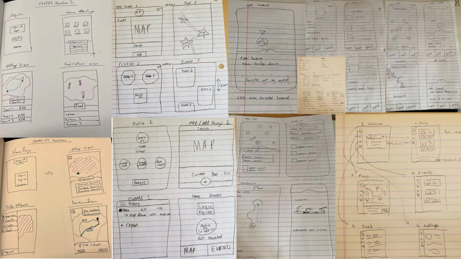
Based on the User Flow, each group member created sketches for how each key screen of the app could work and function. We presented each sketch and communicated on how we can take a feature from each sketch and incorporate them into the next prototype. We learned the general design for how the app will look and flow.
Physical Prototype
Before creating a digital prototype, we created a physical prototype. We had it go through a usability test with potential users focusing on how each key feature would work, if it is functional, if the layout is ideal, and if it were something they would like to use. The feedback we received from them was very informative. We learned the layout is clean and simple, easy to navigate, and the flow works well.
Mid-Fi Prototype
After creating the mid-fi prototype we had it tested with potential users figuring out what the users liked and didn’t like, how the digital model would function, and any features they would like to have added. We did this to get an understanding of what was the most important features the users wanted and how they interacted with the screens. As well as getting an understanding of how the layout of the was.
Improvements
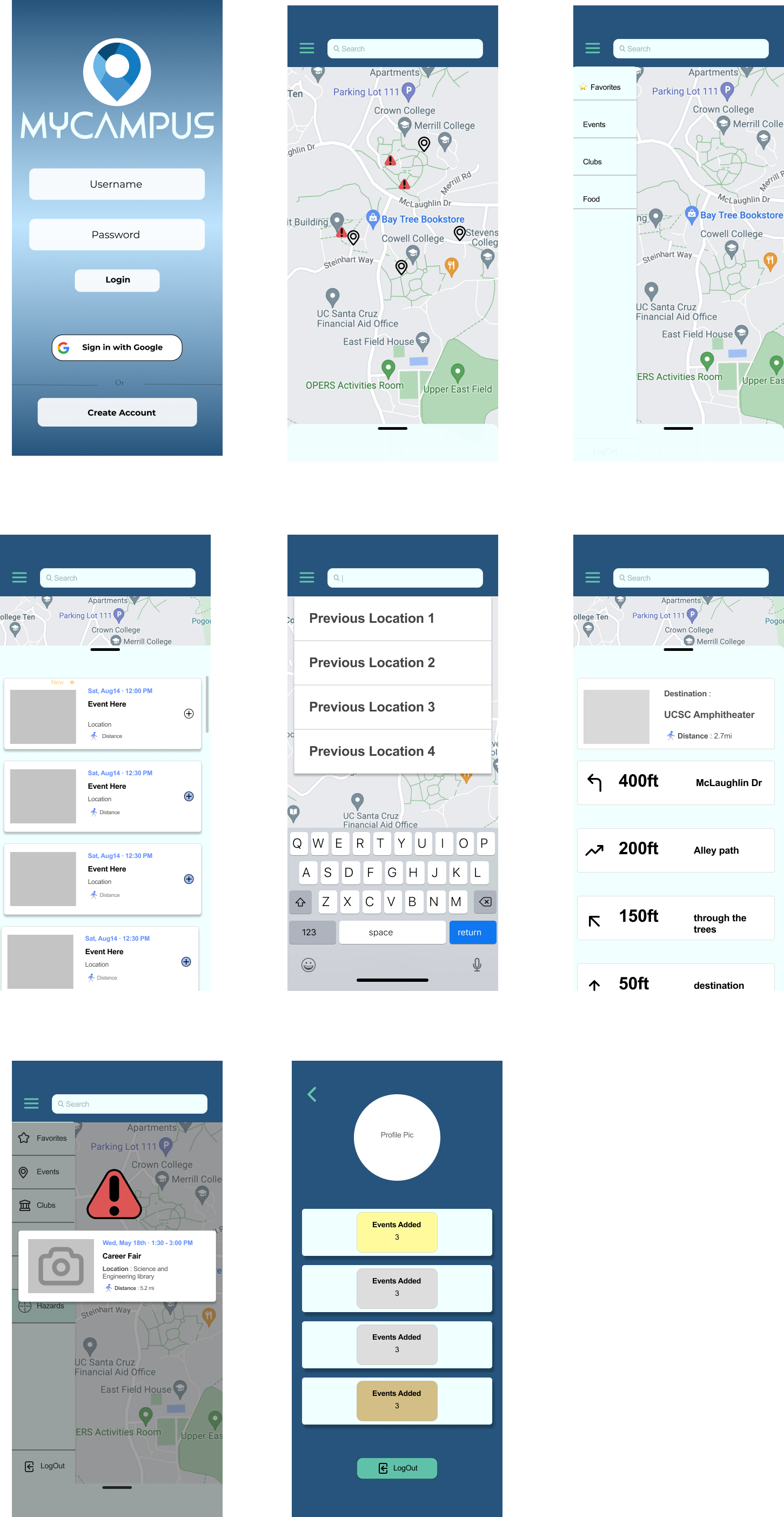
Improved layout of all the screens
Change in color pallete
Resize login screen boxes to be identical
Alert menu now a swipeable pop-up
Different icons on the map for events, hazards, and other specific filters
Polished the UI of the app
Validation Test
The final prototype of MyCampus was tested among college students new to their campus. They enjoyed how it is not just an event finder but also a campus navigator. All our testers enjoyed the simplicity of the app while giving them the opportunity to connect with their school better with its user-run interface of live updating on events and roadblocks. The testers had an easy time navigating the app and thought the flow worked very well. They had no issues figuring out what each feature did.
Overall the app was very well throughout, easy to use, and solves the issue of connecting students with their schools easier.
Whats next?
When adding to the map have it more clear where the event or hazard is being added.
When adding an event to the map, have different icons established for food, clubs, etc. instead of events then change the filter afterward.
Gather more data through testing and iterate the design based on the feedback given.
Takeaways
I learned through first-hand experience of creating an app end to end. Having clear goals and success metrics every step of the way making sure what I was producing was correct. The whole design process from researching our users, crafting solutions, and testing the product after every phase of the project. Overall owning, creating, and delivering a finished product from start to finish was an amazing learning experience.


